

The Rose Order is a crime drama centered on a woman navigating the dangerous world of a criminal organization. The series explores power, loyalty, and survival in a world where the stakes are high and trust is hard to come by. Written and directed by Tamika Lee.


Quick Facts
- Client: Tamika Lee
- Industry: Film
- Project Type: Print Marketing Materials
- Role: Designer, Art Direction
- Tools: Adobe Illustrator, Adobe Photoshop
- Skills Demonstrated: Poster & Key Art Design, Visual Storytelling, Typography & Type Treatment, Layout & Composition, Image Selection & Cropping, Photo Editing & Image Treatment, Color Theory & Visual Contrast, Brand & Visual Identity Development, Promotional & Festival Marketing Design
Key Takeaways
- Turned existing assets into a cohesive visual story. The photography was already created, so my job was to recognize what each image could contribute and build the design around those strengths.
- Typography can become part of the identity. The distressed title treatment and oversized type gave The Rose Order a distinctive visual presence rather than treating the title as ordinary poster copy.
- A strong concept can flex across different executions. The two posters use different compositions and treatments while still feeling like they belong to the same project.
- Design can establish tone before the audience knows anything about the story. The contrast, red-and-black palette, distressed textures, and character-driven imagery were all deliberate choices to suggest a world that felt dramatic, dangerous, and contemporary.
- Traditional graphic design and production workflow. No AI-assisted design tools were used.
The Challenge
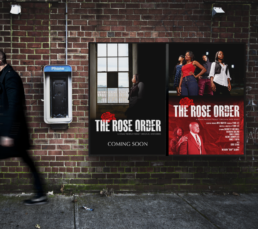
The challenge was to create promotional posters for a web series using photography that had already been produced. My role was not to direct or produce the photography, so the design challenge was figuring out how to take the available images and build a compelling visual identity around them.
The posters needed to communicate the tone of the series, introduce the characters, establish a recognizable title treatment, and provide enough production information for festival and promotional use.
The project also called for more than one visual approach. One poster needed to work as a traditional festival-style one-sheet, while another could take a more stylized approach to the characters and story.
Design Process
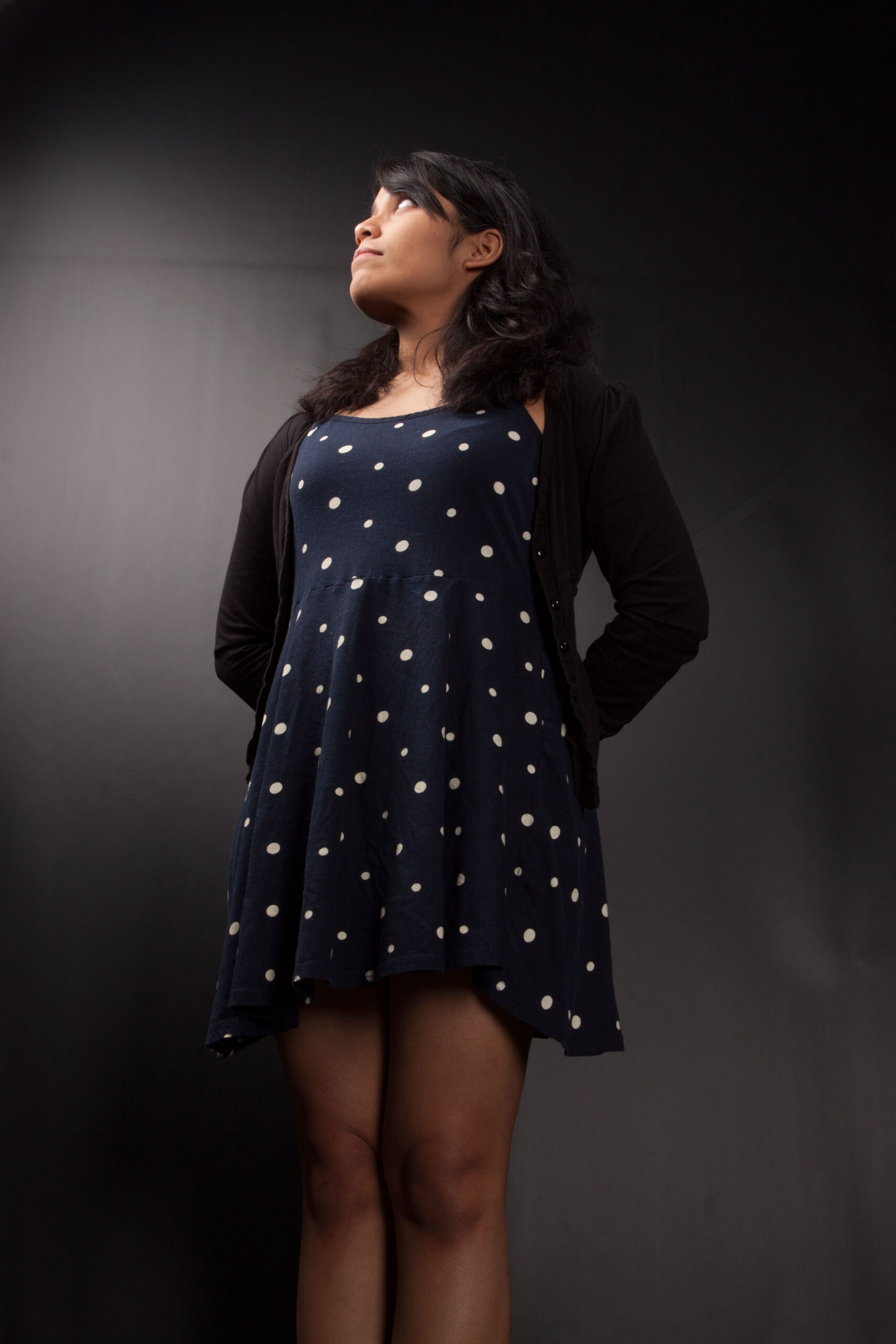
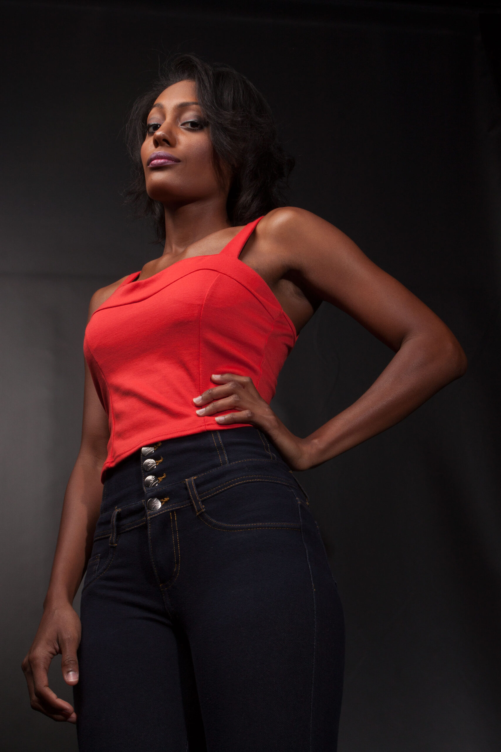
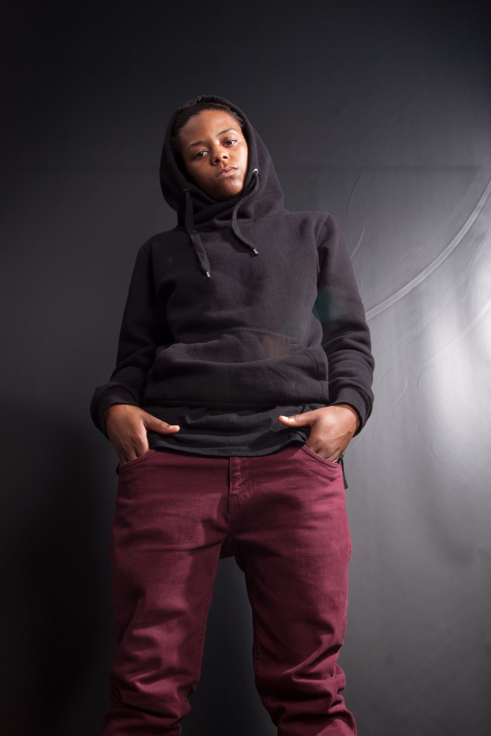
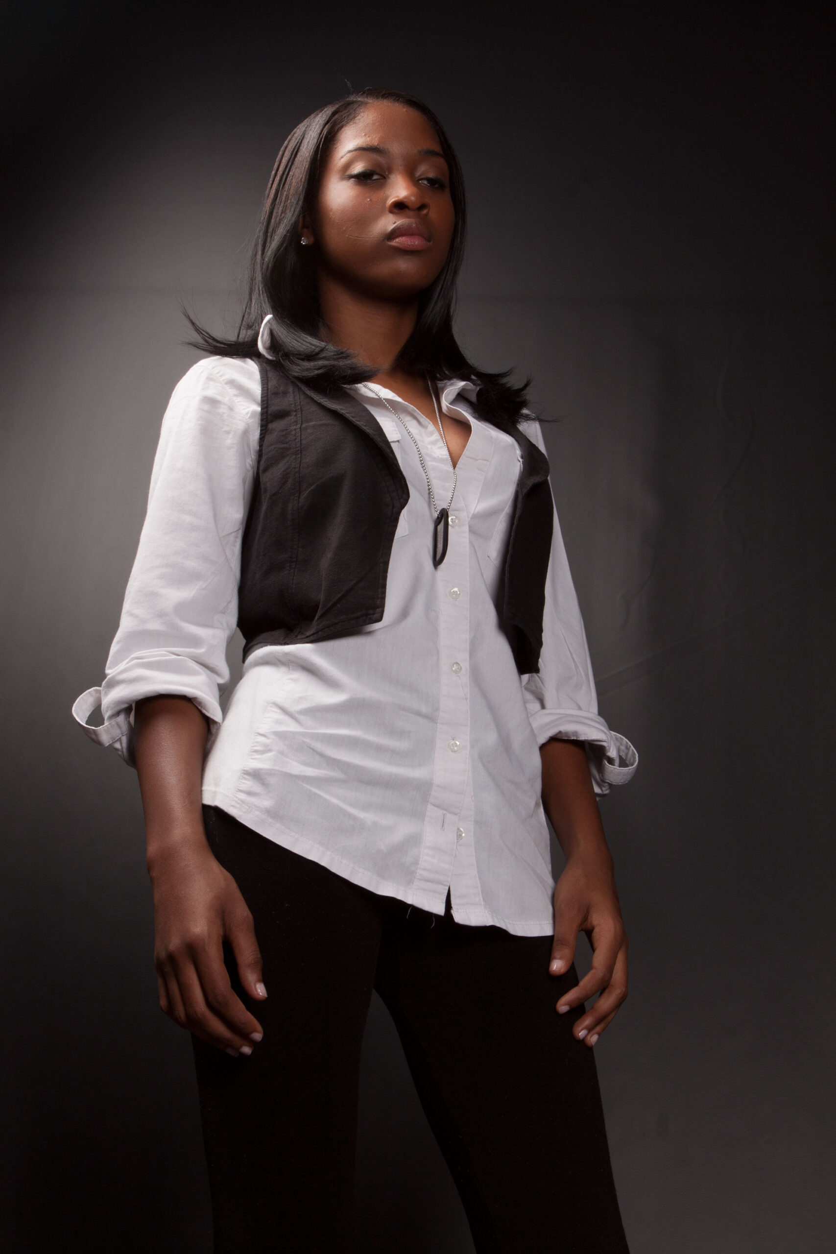
I started by looking at the available photography and identifying the images that gave me the strongest combination of character, attitude, composition, and visual storytelling.
From there, I built the poster designs around the idea of contrast. The black, white, and red palette gave me a strong foundation, while the photography provided the human element.
The title became a major graphic element. I paired large, distressed white typography with the red rose to create a visual mark that was immediately identifiable.
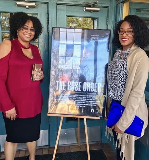
For the festival poster, I kept the composition relatively restrained, allowing the single character image and large title to do most of the storytelling. The second poster gave me more freedom to explore the ensemble cast, red overlays, texture, and a more dramatic editorial composition.
Deliverables
- Digital Brand Assets
- Posters / Event Signage
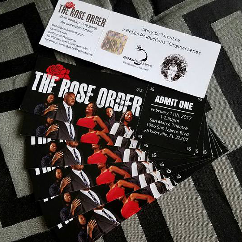
- Printed Tickets
Tools & Workflow
Design Software
- Adobe Illustrator (vector design and production assets)
- Adobe Photoshop (color adjustments)
Design Disciplines
- Poster Design
- Visual Storytelling
- Typography
- Layout & Composition
- Image Selection & Treatment
- Color Theory
- Brand Identity
- Promotional & Festival Collateral
What I Learned
Sometimes you’re handed the assets that exist and have to figure out how to make them work. That means being intentional about cropping, scale, hierarchy, typography, color, and image treatment rather than trying to force the photography to do all of the work.
It also reminded me that a poster has to communicate incredibly quickly. Before someone reads the credits or knows anything about the series, they should already have a sense of what they’re looking at, what kind of story it is, and why they should want to know more.
And perhaps most importantly, I learned that creating multiple versions of the same promotional piece demands an understanding of what needs to remain consistent and where you have room to push the visual language further.