

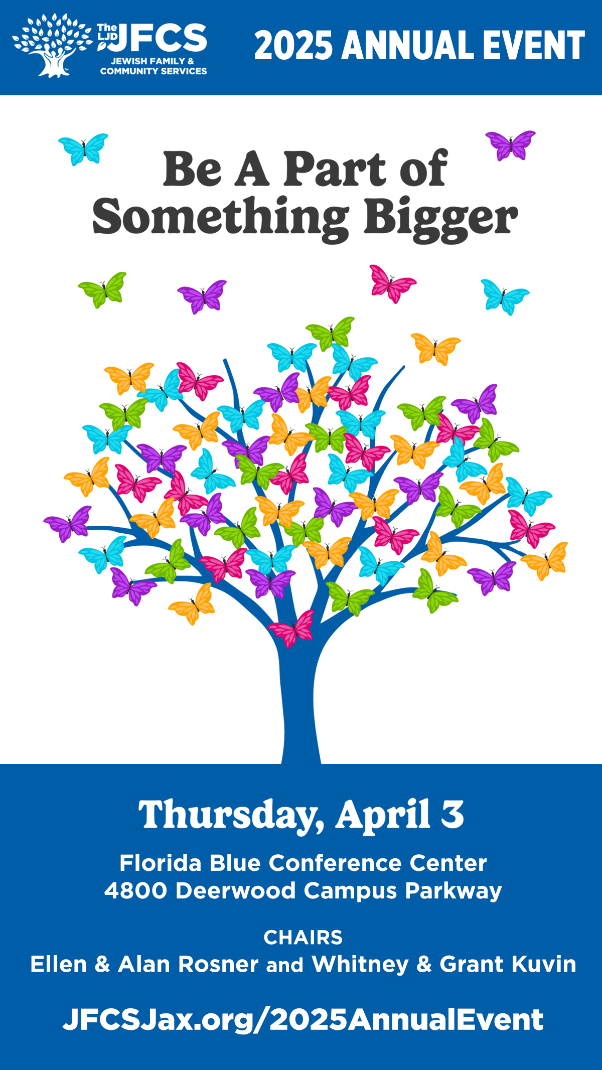
The LJD Jewish Family & Community Services (JFCS) is a leading child welfare and family social work organization located in Northeast Florida. The client needed assets to promote their annual fundraising event.


Quick Facts
- Client: The LJD Jewish Family & Community Services (JFCS)
- Industry: Nonprofit
- Project Type: Print Marketing Materials
- Role: Assistant Designer
- Turnaround: 12 days
- Tools: Adobe Illustrator, Adobe Photoshop
- Skills Demonstrated: Campaign Design, Visual Communication, Environmental Graphic Design, Large-Format Design, Typography, Layout & Composition, Visual Systems Development, Print & Digital Design
Key Takeaways
- Created print materials based on digital assets established by the Creative Director.
- Applied typography, color, and layout to enhance promotional marketing.
- Traditional graphic design and production workflow. No AI-assisted design tools were used.
The Challenge
Maintaining a visual direction predetermined by other stakeholders.
Design Process
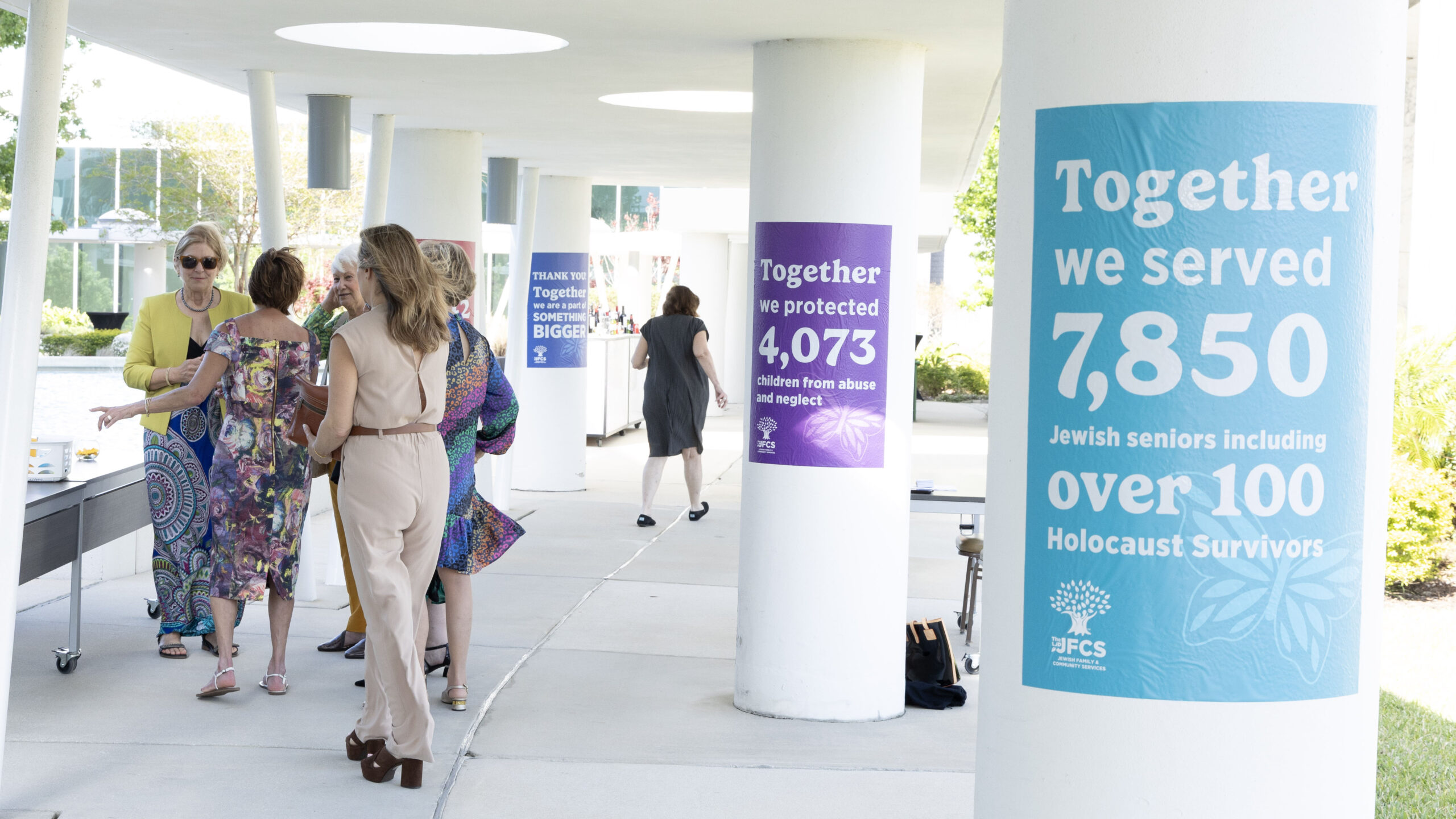
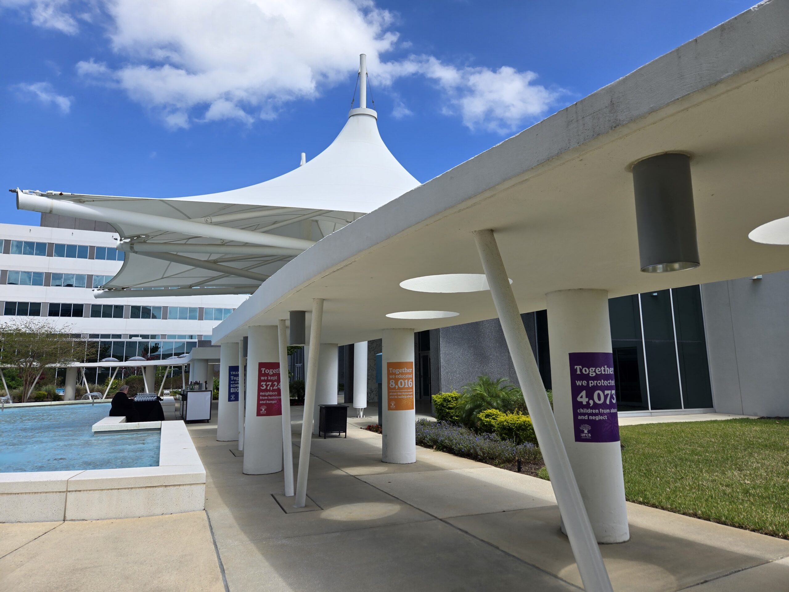
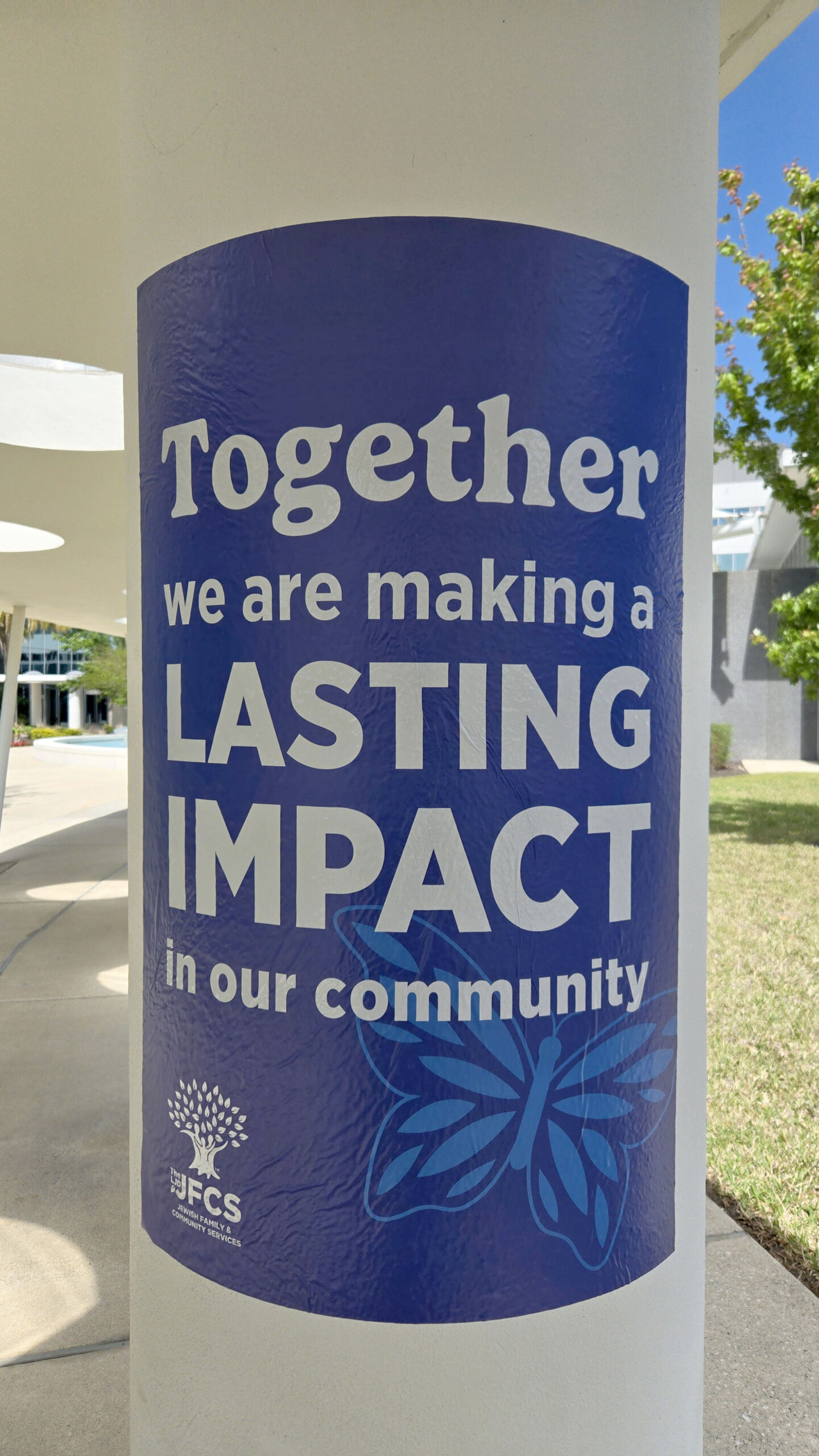
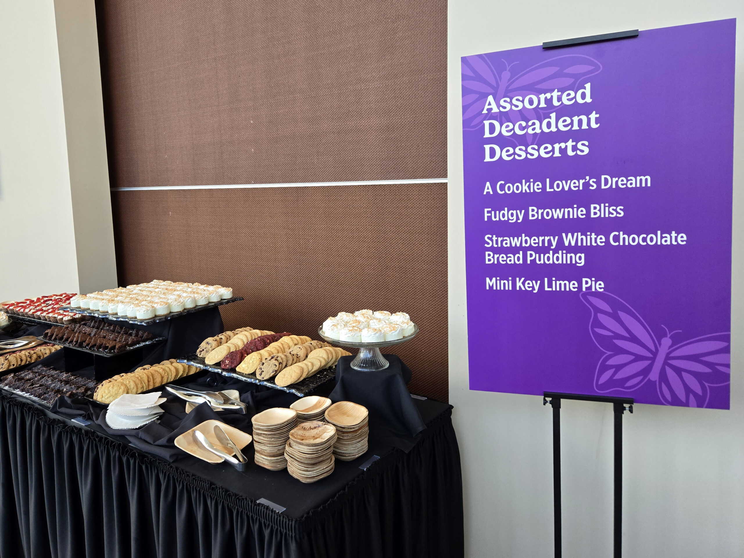
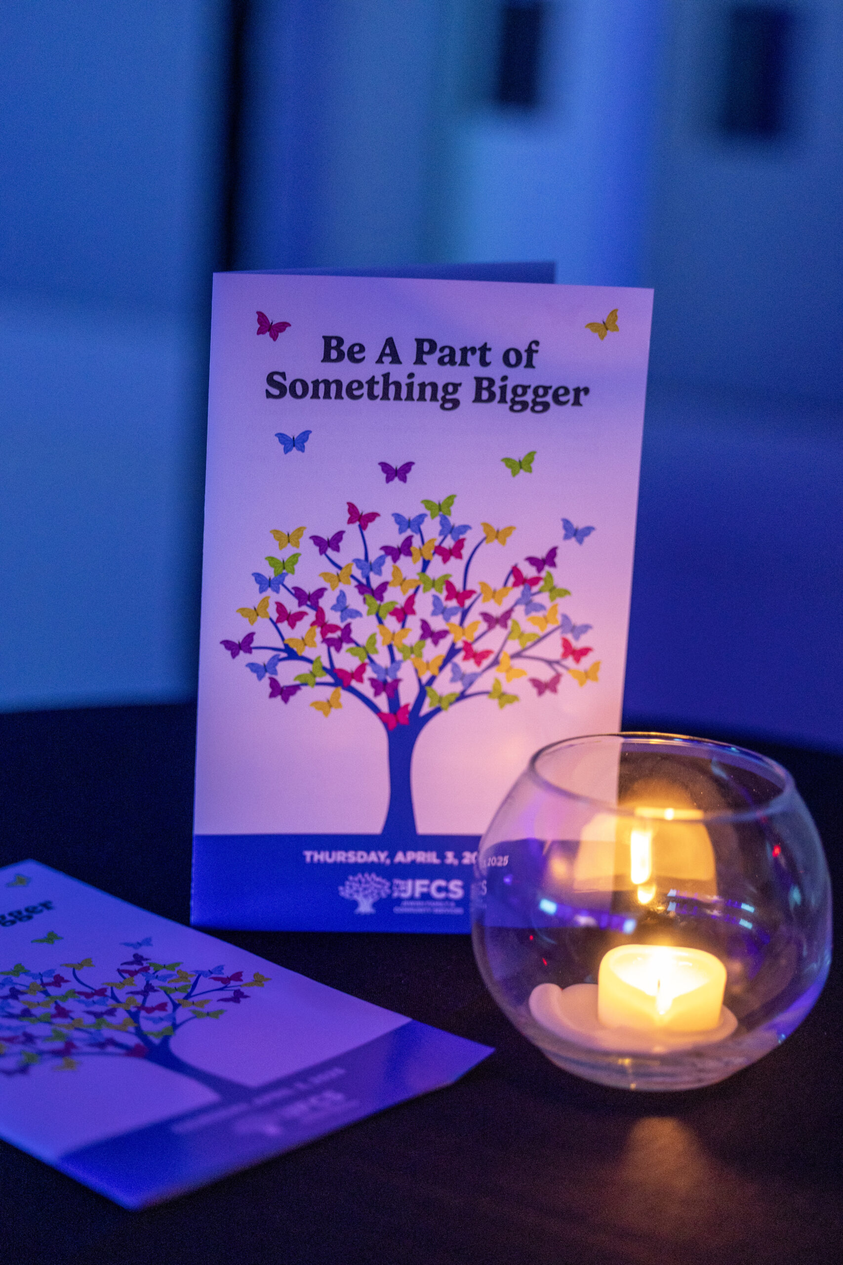
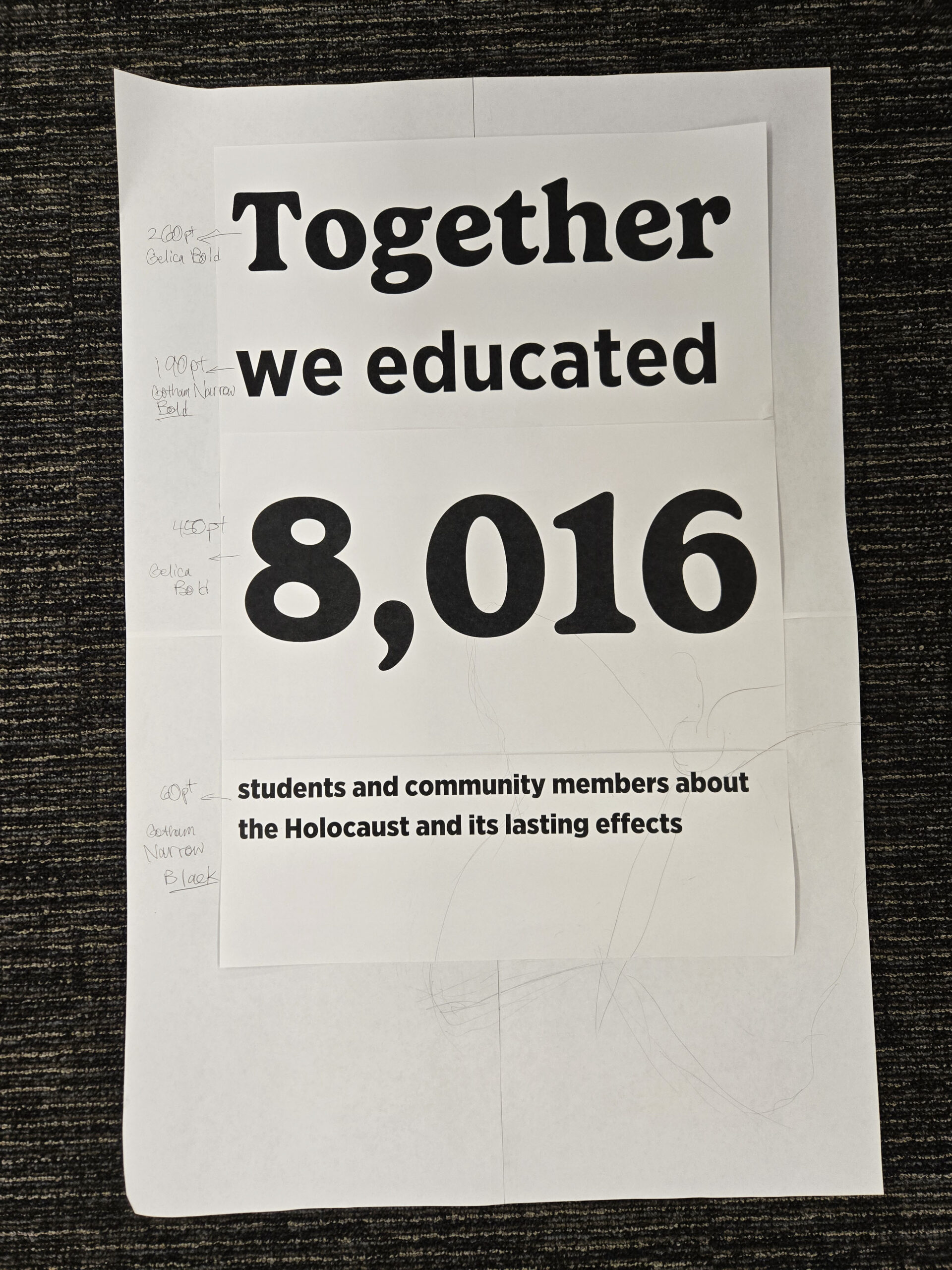
With the butterfly theme, main typeface, and colors already established, I first sketched a template appropriate for an oversized column wrap layout. The goal was to complement a spring theme that already included food station menu boards, table decorations, and programs.
The unified look of the resulting prints celebrated the funding achievements that were met thanks to the organization’s corporate partners and donors through vibrant colors and impactful messaging.
Deliverables
- Column Wraps
- Event Signage
- Printed Materials
- Digital Promotional Assets
- Menu & Meal Station Signage
Tools & Workflow
Design Software
- Adobe Illustrator (vector design and production assets)
- Adobe Photoshop (color adjustments)
Design Disciplines
- Campaign Design
- Environmental Graphic Design
- Print Design
- Digital Design
- Event Design
- Brand Communications
What I Learned
One of the things I enjoyed most about this project was seeing how a design can become part of an entire environment. I took particular pride in creating column wraps that felt like a natural extension of the other event assets, rather than isolated pieces of signage. The project reinforced for me how important visual consistency, scale, and context are when translating an established creative direction into a physical space.